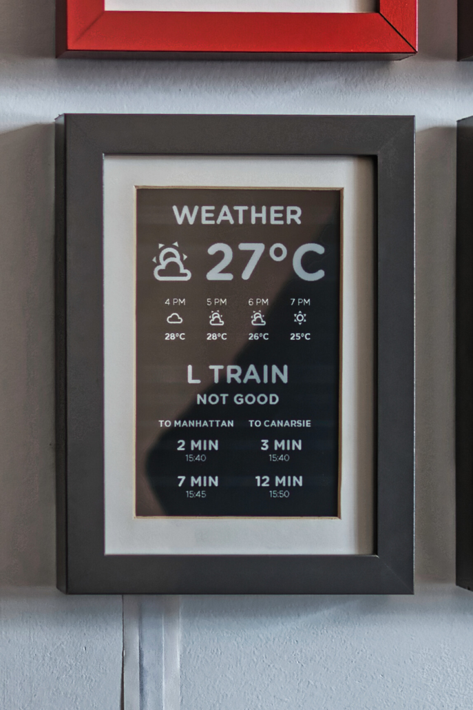
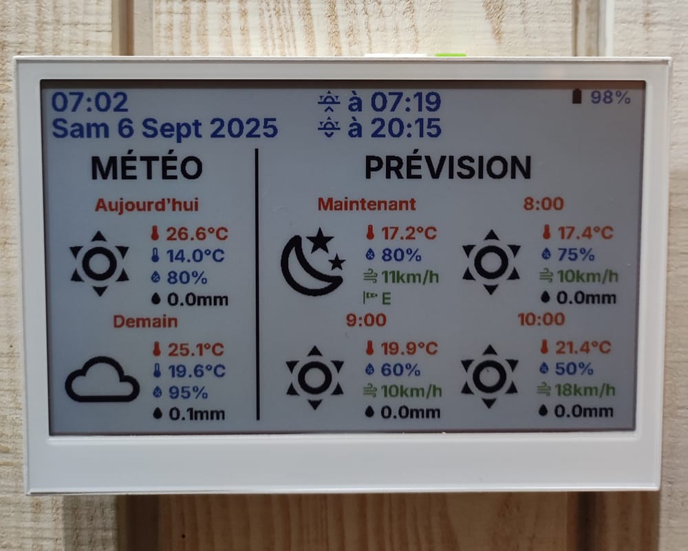
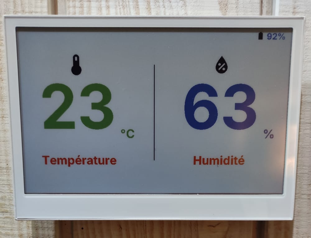
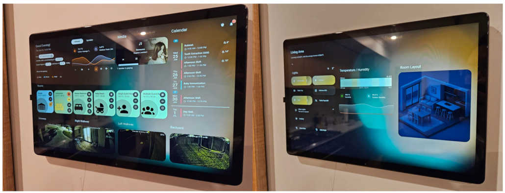
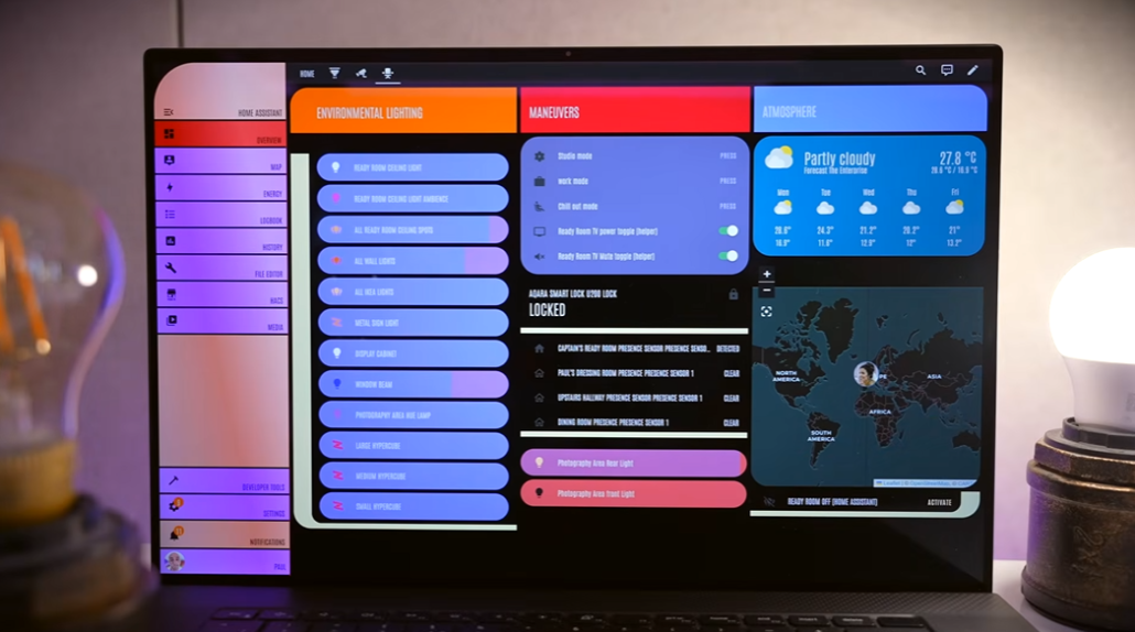
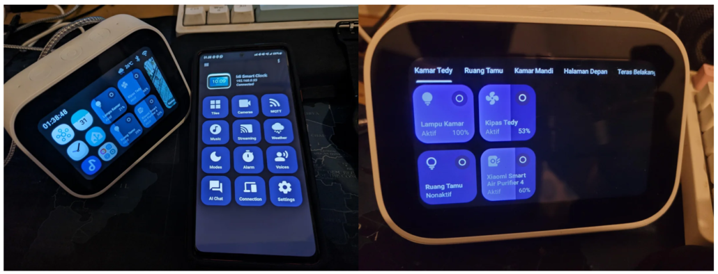
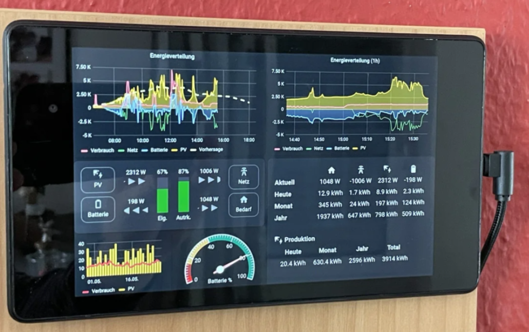
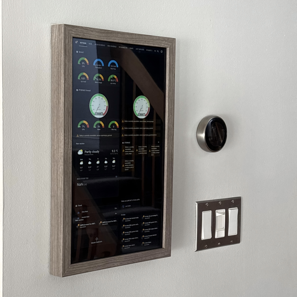
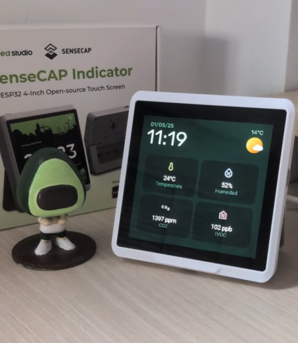
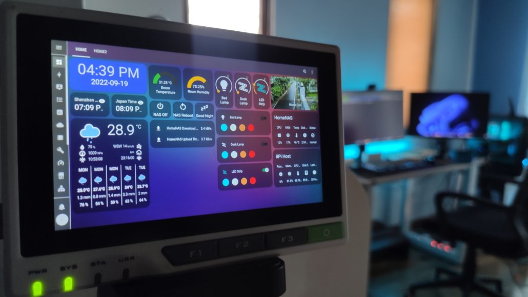
Home Assistant Display Showcase: From Community Designs to Your Own Setup

Explore how to pick the right Home Assistant Display among esphome epaper display, and home assistant touch screen. You can also expect to learn how to build a beautiful, functional lovelace dashboards for your smart home setup.

In our previous article The Ultimate Guide to Home Assistant Displays: Transform Your Smart Home, we explored different display technologies and how to choose the right screen for your Home Assistant setup. Now, let’s dive into the creative side – seeing how others have implemented their displays and learning how to create your own perfect Home Assistant dashboard.

Real-World Inspiration: Community Dashboard Gallery

The Home Assistant community continuously pushes the boundaries of what’s possible with smart home displays. Let’s explore some outstanding examples that showcase the versatility of different display technologies.

E-Ink Excellence


The Modern Art Display

When Madelena shared this black-framed e-ink display on the Home Assistant Community, it demonstrated how smart home technology can blend seamlessly with interior design. Their setup uses a Waveshare 7.5″ e-Paper screen housed in an IKEA RIBBA frame, displaying weather data and transit information with striking clarity. The black background with white text not only looks elegant but also maximizes readability and minimizes power consumption.

Personal Information Center

Gumpy5’s creation brings a fresh perspective to daily information display. Using a white background with crisp black text, this dashboard cleverly incorporates moon and star patterns to represent nighttime conditions. Beyond basic weather and date information, it features a special events reminder system, ensuring important dates are always visible at a glance.

The Green Thumb Monitor

AColdFloor’s plant monitoring display brings personality to functionality. Using red accents and leaf patterns, this setup proves that technical displays can have character. The “health bar” visualization makes complex sensor data instantly understandable – a perfect example of user-friendly design.

The full-color Dashboard with onboard sensor 

In a review on HACF.fr, the editor used Seeed Studio’s reTerminal E1002 7.3-inch full-color ePaper to create a smart dashboard. It displays temperature and humidity—measured in real time by the built-in SHT40 sensor—current weather and forecast, battery voltage/level, and date, time, and sunrise/sunset. Physical buttons allow switching between pages (e.g., one page shows temperature and humidity, another shows weather and sunrise/sunset). A buzzer sounds five times when the battery drops to 10%. This device is not just a display—it also serves as a control center.

The Upcycled Kindle Dashboard for Utility

John500y2k demonstrates the potential of repurposing existing hardware. This converted Kindle now serves as a comprehensive utility monitor, displaying temperature data from multiple rooms alongside energy usage and costs. The project showcases how limited screen real estate can be efficiently used to present complex information clearly and effectively.

The Energy Consumption Visualizer

Mat Zolnierczyk’s implementation of the XIAO 7.5″ ePaper Panel focuses on power monitoring. Through carefully designed bar charts and data visualization, this dashboard transforms complex energy consumption data into easily digestible information. The project particularly shines in its attention to battery efficiency and update timing optimization.

The Pet Environment Monitor

AbbreviationsFit6561’s creative solution tackles a unique challenge based on Seeed Studio XIAO 7.5” ePaper Panel: monitoring air quality around pet areas. This specialized dashboard displays comprehensive environmental data including temperature, humidity, CO2, TVOC, and NH3 levels. It’s an excellent example of how e-ink displays can be used for specific, practical applications while maintaining battery efficiency.

LCD/OLED Showcase


The Command Center

ElementZoom’s six-dashboard system represents the pinnacle of comprehensive home monitoring. Each screen is carefully crafted to display specific categories of information, from environmental data to security status. The vibrant LCD display allows for rich, colorful visualization of complex data sets.

The Sci-Fi Interface

Paul Hibbert’s creation embraces a futuristic aesthetic while maintaining functionality. The dashboard features a striking color scheme and modern design elements, presenting traditional smart home controls like lighting and weather alongside more advanced features such as world mapping. It’s a perfect example of how visual appeal can enhance user experience.

The Desk Companion

AyraHikari’s clever repurposing of a Mi Smart Clock creates a compact but powerful dashboard. This small-format display proves that effective home automation control doesn’t require a large screen. The project demonstrates how existing smart devices can be transformed into more capable Home Assistant interfaces.

The Solar Status Display

Habitoti’s photovoltaic monitoring dashboard combines aesthetic appeal with practical functionality. Using a natural color palette and intuitive visual elements like line charts and circular gauges, it makes complex energy production data easily understandable. The display serves as both an information center and an engaging visual element in the kitchen environment.

The Family Command Station

D64017108’s comprehensive dashboard serves as a complete family information center. This large-format display elegantly combines multiple data streams – from presence detection to children’s schedules, pool conditions to security status. The layout demonstrates how a well-designed interface can manage complex information without overwhelming the user.

The Desktop small controller

Aguacatec’s Home Assistant display is a compact, almost square design with smoothly rounded edges based on Seeed Studio SenseCAP Indicator D1. It uses a clean, minimalist UI with large icons, clear typography, and a grid layout, making environmental data easy to read at a glance.

Creating Your Perfect Dashboard

Whether you’re starting fresh or upgrading an existing setup, there are multiple paths to creating your ideal Home Assistant display. Let’s explore the options, from simplest to most customizable.

Direct Installation: The All-in-One Approach

For those seeking a straightforward solution, devices like the reTerminal series offer a complete package. With a pre-installed operating system and native browser support, you can access Home Assistant directly and use the built-in Lovelace UI editor for dashboard creation.

Key Benefits:

  • Immediate functionality out of the box
  • Familiar web interface
  • Real-time preview of changes
  • No additional software required

ESPHome Integration: Flexibility Meets Efficiency

The ESPHome integration method, particularly suited for devices like the XIAO 7.5″ ePaper Panel, offers two distinct approaches:

1. The Simple Path: Puppet Plugin

Perfect for those who want quick results without diving into code:

  • Install the Puppet plugin through Home Assistant
  • Design your dashboard using the familiar Lovelace interface
  • Let Puppet handle the automatic screenshot capture and display updates
  • Focus on design rather than technical implementation


2. The Customization Path: ESPHome YAML

For those who want complete control:

  • Define every aspect of your display through YAML configuration
  • Create custom layouts with precise element positioning
  • Implement complex data visualization
  • Add custom fonts and graphics

MQTT Integration: Advanced Control

Devices like the SenseCAP Indicator open up additional possibilities through MQTT integration:

  • Real-time data exchange with Home Assistant
  • Interactive control capabilities
  • Custom graphics through LVGL
  • Visual design tools via SquareLine Studio

These are just some of the popular ways to integrate the display and design UIs with Home Assistant, but there are plenty more creative ideas out there. Got a favorite setup? Drop it in the comments and share it with the community!

Design Tips for Success

1. Know Your Display’s Strengths

  • E-ink excels at static information displays
  • LCD/OLED works better for dynamic content
  • Consider refresh rates and power consumption


2. Plan Your Layout

  • Sketch your design before implementation
  • Group related information logically
  • Leave room for future additions
  • Consider viewing distance and angle


3. Choose the Right Tools

  • Start with built-in tools for simple needs
  • Graduate to custom solutions as needed
  • Consider using visual design tools for complex layouts
  • Take advantage of community resources

Looking Forward

The world of Home Assistant displays continues to evolve, with new technologies and integration methods emerging regularly. Whether you choose a simple setup or dive into full customization, the key is starting with a clear vision of what you want to achieve.

Remember, your perfect dashboard might take several iterations to achieve. Don’t be afraid to experiment, and take inspiration from the community while adding your own unique touches.

Resources for Further Learning

Summary

Creating your ideal Home Assistant display is a journey that combines technical knowledge with creative design. Whether you choose the simplicity of pre-built solutions or the flexibility of custom configurations, the key is matching your choice to your needs and abilities. The examples we’ve seen from the community show just how diverse and creative these implementations can be. 

What’s your next display project? Share your ideas and experiences in the comments below!

About Author

Calendar

August 2025
M T W T F S S
 123
45678910
11121314151617
18192021222324
25262728293031